Your guide to charity annual reviews: 6 ingredients
For some charity communicators, the very idea of creating this year’s annual review will send shivers down your spine. After all, didn’t you just sign the last one off a couple of months ago?
For others, it’ll be an opportunity to play with ideas, to create, and to get right under the skin of their organisation and show its best aspects to the world.
Most sit somewhere in between. And we all need a bit of inspiration from time to time.
To get you started, I’ve scoured the charity sector to uncover the 6 key ingredients that can make your annual review work.
1. Digital integration
Five years ago, the very idea of an online annual review meant being able to download a PDF of the printed document from the charity’s website.
Things have changed. Now, some kind of digital or online integration is a ‘must do’. In fact, some larger organisations have made annual review micro-sites their main review, with the printed version the minor addition.
And what’s not to like? Publishing online allows you to include videos and animations, making once static information come alive. It allows the reader to click around the annual report in the way that most suits them (while behind the scenes you can measure what information most interests your readers).
You can provide calls to action (donate, volunteer, leave your email) that can be completed right away. And you can use other social media to send viewers directly to content in your annual review that is directly relevant to them. With whizzy dynamic and colourful annual reviews, you can make your information – and your brand – look great.
Top examples:
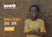
- Retrack – This overseas homelessness charity has taken the simple but effective option of creating a digitised, dynamic PDF for their annual review. It is a good looking document that you can download from the website, but it contains internal links. You can navigate around the PDF using the links, and it also links out of the annual review to YouTube videos and to areas of the main Retrack website. Simple and cheap, and a good starting strategy for any charity wanting to get started in this area.
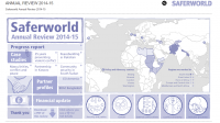
- Saferworld – This peace research and policy charity has also taken a simple approach to their online annual review. Readers begin at a dynamic online graphics-led contents page, which draws out further information into pop-up boxes. Behind it sits a very detailed and involved annual review, so this more accessible mini version is welcome.

- British Heart Foundation – The layout of this online annual review is simple and clear, with very basic navigation. There’s a good mix of case studies with great photography, solid but short information and whizzy infographics keep you engaged. The end of the review offers you a number of places to go, including downloading PDF files of key statistics and achievements for UK countries, grants made, and inviting you to donate and share – as any good website should.
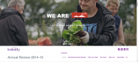
- Livability – This faith-based disability organisation’s online annual review can’t help but attract because the video-content begins as soon as you arrive. There are great some great dynamic graphics, and good case studies. But what makes this website special is that it’s clearly designed to be accessible to people with learning difficulties: it’s written simply, with bold headlines and easy-to-understand signposting for what to do or where to go next. All charities have something to learn from that.
Read about the other 5 key ingredients
2. Good images