Coupled with a great quote, or a startling statistic, your images do most of the work in your annual review. For many readers they’ll probably be the only things they look at. (Despite how hard you’ve worked on writing the rest of the report!).
So you’re going to need images. And good ones too.
In a world where people can take pretty decent images themselves on a smartphone, don’t be tempted to think you can do it yourself. If you can afford it, you need a photographer with decent equipment, an eye for a good image and angle, and who can take a brief from you about the sense and tone you’re trying to convey.
Particularly effective are images that have a ‘wow’ factor – big expanses of space or viewing something relevant from an original angle; that feature people – particularly service users; that are cuddly or heart warming; and for small local charities, images of people in recognisable places generate a sense of belonging.
Small charities are just about the only place where you can get away with pictures of huge cardboard cheque handovers – but you should still use them sparingly!
Top examples:
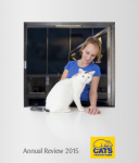
- Cats Protection – Animal charities have it on a plate when it comes to photography. Cats Protection supporters love cats, so cute and cuddly pictures of cats is the job half done. In this annual report, the cover concept is clever. A nervous (but beautiful) cat is being reassured by a staff member, the picture being taken as if from inside a veterinary holding unit looking outwards. The back cover features the same image, only the cat is gone and the staff member is cleaning the glass front of the unit – obviously preparing for the next guest. The implication: another cat rescued and found a home, we’re preparing for the next one. Throughout, the review has not been afraid to use lots of space instead of endless close ups, and given over full page bleeds for some of the best images.
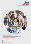
- Royal Air Forces Association – This charity knows its audience. The front page is a collage (shaped into the distinctive RAF ‘target’ logo) of bright images that are repeated inside. Beneath the cover there is a good mix of young men and women in combat fatigues, older men and women in full dress uniforms, hugs from families for returning service personnel, plenty of medals and regimental colours, young service families at home waiting for their loved ones, older people reminiscing, and RAF personnel simply joshing around. If you’re involved in the services, the images make you feel part of – as the report’s key message intends to convey – the RAF family.
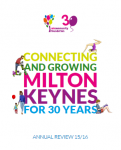
- Milton Keynes Community Foundation – There’s something about the big bold colours, the friendly faces and the hand-drawn, almost child-like illustrations in this report that can’t help but compel. The community centre has used lots of numbers and statistics to accompanying the images, giving the impression that lots is being achieved by lots of local people. Exactly what you want from a local charity. Bright, busy and really good fun.
Read about the other 5 key ingredients!


