Every now and again, an idea for an annual review format comes along that has you kicking yourself: why didn’t I think of that? Truly great ideas either ‘pop’ into a creative’s mind or – possibly more often – are paid for through marketing agencies, who specialise in the ‘wow’ factor.
The important question to ask about super-innovative ideas is: does this annual review really just sparkle, or does it also do the job you need your annual review to do? Annual reviews still have a function: to pass on information, get people to donate, join up or become a long-term partner.
So if you’re determined to come up with a truly original idea, remember to ask yourself: are you creating just sparkly glass or a diamond?
Top examples:
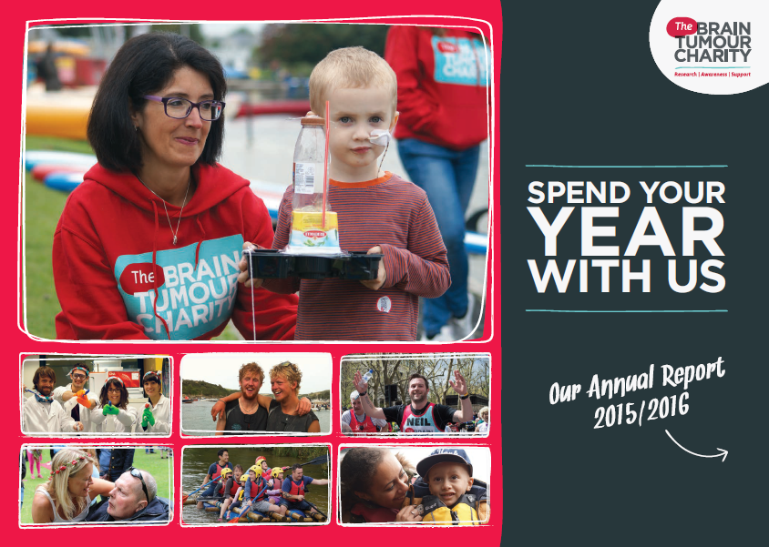
- The Brain Tumour Charity – This cancer charity has produced a a week-by-week desk planner as their annual review. Each weekly page contains information about brain tumours, or a case study, a report back on the charity’s work, or a quote from a patient or supporter. Each page also has space for doodles, little brain teasers and word searches relating to brain tumours. What better way to have an audience engage with your messages than to have it on their desk every single day, and to have readers unscrambling anagrams about your core subject matter?
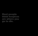
- Keech – This Bedfordshire-based hospice won the Third Sector Award for its annual review last year, so perhaps its no surprise to see another excellent outing. But it’s a very brave move indeed to have only a matt black cover for an annual review. The only words embossed on the front are: ‘Most people think hospices are where you go to die.’ But inside, the whole report is a riot of colour and happiness that aims to show that Keech is about life, not death. The innovation is in the surprise contrast between the cover and the upbeat interior, and it’s pulled off well. Even the section on Death and Dying has a huge rainbow across the double page spread. There are also really decent numbers-led infographics.
Check out my innovative annual review examples from last year
Bringing it all together
To finish where we began, these days of interactivity mean charities can’t get away with not doing something online with their annual review. But to do something that entails lots of the other magic ingredients really takes something special. Some of the biggest charities do this impressively, but there was one particularly impressive annual review from a smaller organisation that stood out from the others.
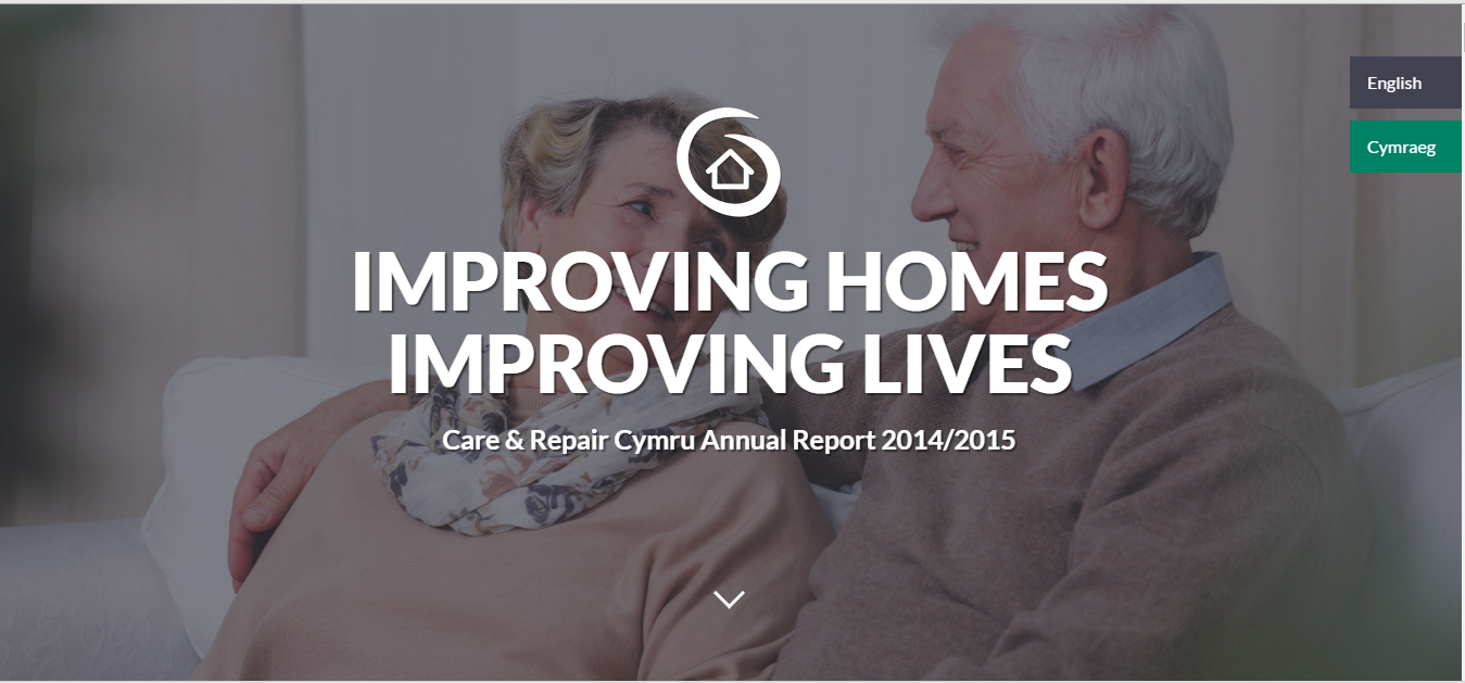
- Care & Repair Cymru – a Welsh charity that supports older people and its own sister housing agencies. The annual report is published online and the layout is simple, but there’s plenty going on to attract the eye, keeping you engaged. There are funky dynamic illustrations and graphics, a set of highlights of the year with more funky icons, more stunning infographics making key points. You’ll find a series of short and meaningful case studies, some specific reporting against targets, and lots of good quality human images adding a friendly consistency across the online review. And this is where the internet really comes into its own: the whole site can be turned into Welsh at the click of a button.
Read about the other 5 key ingredients!
2. Good images